Color Refresh
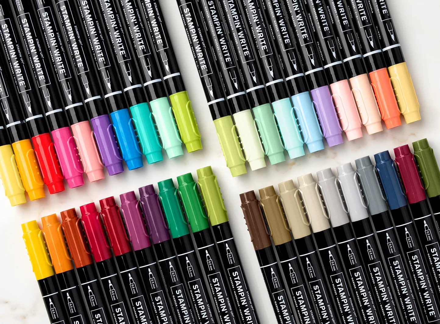
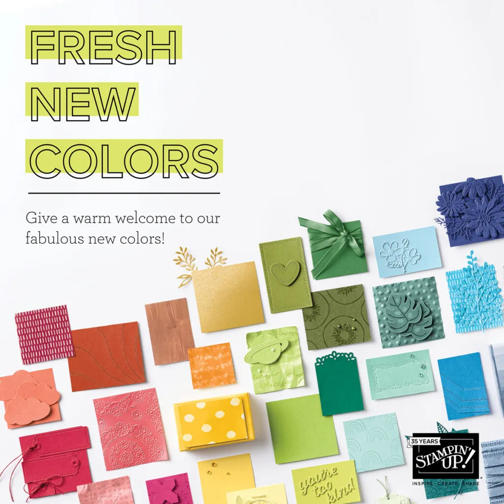
So, in 2013 and 2018 Stampin’ Up did what was called a color refresh/revamp. In 2013, ten colors were retired, and nine In Colors returned as permanent colors. In 2018, it was a huge change, since they were also switching over to the new style of ink pads, so they took the opportunity to really shake things up. They moved three colors (black, white, vanilla) outside of the color families completely, giving us a few more options, brought back six old In Colors and introduced ten new colors, in additional to the normal yearly In Color swap. 2018 welcomed 21 new colors.
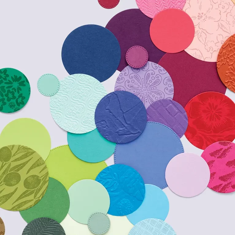
Following that five year interval, and being post-Covid, this would be a good time to shake things up, if they were going to. Here’s how the families stand now, and what I see as their weaknesses. Here’s where I think Stampin’ Up! could benefit from refreshing their color palette.
Neutrals
Night of Navy is super popular, and it should be. However, I never understood Merry Merlot, Mossy Meadow and Night of Navy as ‘neutrals.’ It also makes it hard because three is a decent balance, take away one (Merry Merlot) or two (Mossy Meadow) and unless you replace them with similar values, then it just gets weird.
Regals
This is probably the best balanced and most represented color family. However, there isn’t a single blue shade present. Sorry greens, at least one of the has to go. Based on usefulness and need, I vote for Shaded Spruce. (Don’t worry, I already have the perfect color in mind to replace you.)
Brights
Poppy Parade, you are out of here. It lends little value as a color. We have Real Red (and the possibility of Cherry Cobbler and Merry Merlot), and it isn’t used much in sets.
Gorgeous Grape is a sad one, as it is a perfect purple that we don’t otherwise have, but is super under used, making it a possibility for replacement, even though, I believe it was added during the last refresh. How about just trying to use it more, Stampin’ Up!?
Ok, now a tough call Coastal Cabana is one of my absolute favorite colors, and Bermuda Bay is a brighter but too similar color. This hurts a lot, but I am thinking that it is time to retire Coastal Cabana once again. Pool Party is a different shade but has the subtles well covered.
Subtles
I like Calypso Coral. I’ll admit it has grown on me. However, it is absolutely out of place in this category. Granted it isn’t the deep regal of Pumpkin Pie, or the bright of Mango Melody, thus really defying easy categorization. It is a very popular and useful color, though.
Soft Sea Foam – You are the weakest link, Goodbye.
Petal Pink, I don’t really understand. It is a pale almost pink, almost orange, and yeah, umm. You can join Soft Sea Foam and take a hiatus.
I’ll admit that I would love to trade out Pear Pizazz for Pistachio Pudding, as it is one of my absolutely favorite colors, but it is from 2013, so I don’t see that happening.
Unfortunately, Mint Macaron and Pool Party are another case of colors that I really like that are a little close to each other. I’m going to say that the Mint Macaron is definitely a little more green, so both can probably stay.
Conclusion
It’s not so bad; Stampin’ Up really did a good job with their last refresh to get more balanced color families. I do know that there are some colors that they definitely underutilize, and some that are just difficult to work with. I don’t know what ideas they have in the background, just the In Color palettes that they have given us in the last five years. I am going to use them as my well to revamp these families.


